10 Website Navigation Best Practices
Our independent research projects and impartial reviews are funded in part by affiliate commissions, at no extra cost to our readers. Learn more
It’s exciting to launch a website for an online store, no matter which type you choose. After all, this is you announcing your business to the world!
With your website, visitors expect a positive UX (user experience) and will keep going until they find a website that gives it.
So, as an entrepreneur or small online business owner, what can you do to give the best possible experience as visitors navigate through your website? This article will talk you through what website navigation is, the benefits, and best practices for website navigation.
What is Website Navigation?
Website navigation is the process of roaming around a website. Visitors are guided by a menu, which acts like a table of contents in a book, and there are many styles to choose from.
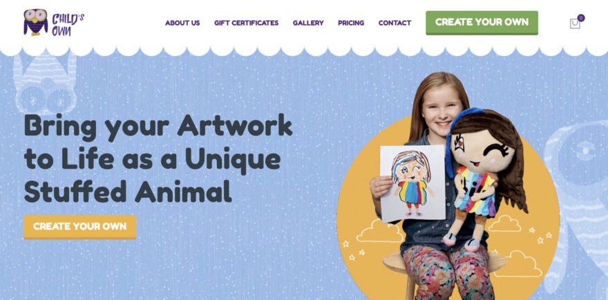
A header menu is the most traditional menu. It’s usually a banner across the top of the page, filled with words or icons. Check out Child’s Own for an example:
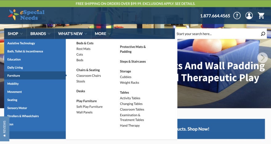
A dropdown menu keeps lots of options streamlined. Rather than display all the links upfront, the visitor clicks on a heading. Links then pop-up underneath, directing users to categorized content, like in the eSpecialNeeds website example.
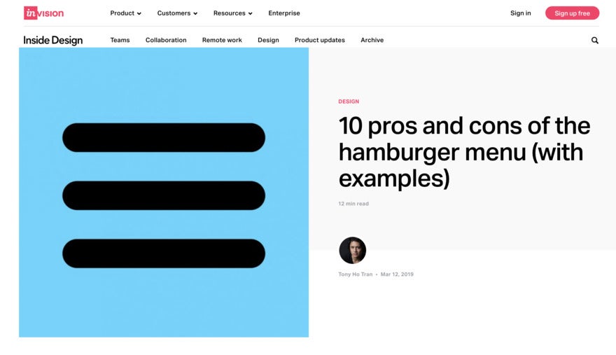
A burger menu is not as delicious as a real burger, but it definitely reminds us of one! It’s got three horizontal lines that when clicked on opens up a menu for visitors. But it’s popular with minimalists because it streamlines a website’s appearance. Our favorite example is Inside Design’s uber-meta burger menu above its article on burger menus.
Advice from the Experts
Top Tip: There are also footer menus on most websites – they act in the same way as the header menu, but tend to contain contact information or social media links.
Benefits of Good Website Navigation
Website navigation should be easy and stress-free. What do we all do when we land on a bad website? We bounce off immediately. But, if we have a positive UX, we’re more likely to stay on to learn more about a brand, buy products, and connect.
If these benefits sound appealing, you just have to know where to get started. Here are 10 website navigation best practices to think about:
10 Website Navigation Best Practices
#1. Start with a Sitemap
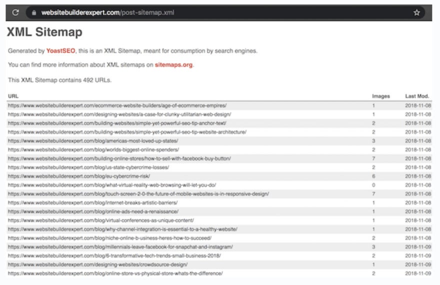
A sitemap gives a snapshot of a website and how the pages are connected. It’s also vital for SEO success because if the search terms they use in their search engine match your website keywords, you’ll show up in their results.
Sitemaps are a bit technical, so we recommend reading our guide on creating a sitemap before you tackle the task.
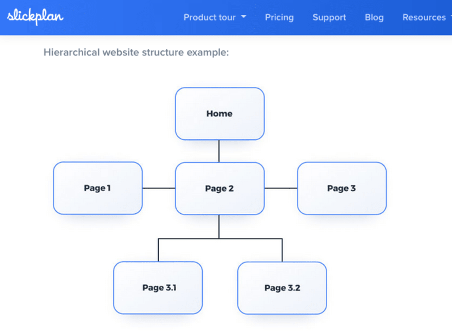
#2. Create a Page Hierarchy
A page hierarchy works just like the popular clique in high school. There’s one Queen Bee (the landing page), the popular kids (the main website category pages), and then those further on the outskirts (subpages).
If you want to know about the clique (or website), you have to go right to the top. That’s where you’ll get most of the key info. The further you trickle down the hierarchy, the less important the pages become.
For a hierarchy, decide what’s the most important information your potential customers need to know, and then work down from there.
#3. Be Specific
When you have a unique brand or online business, you might be tempted to make everything unique on the website, including the language used in your navigation. If your audience can’t consume your content easily, they’ll get frustrated and leave. You have to be specific.
Look at websites in your field and make a note of how they label their navigation – look at the most common words and phrases and what they represent. Even a heavy-duty tech site like Futurism uses specific words so a visitor knows exactly what they offer.

#4. Use a Sticky Menu
This is a bit of a controversial navigation practice because some people love sticky menus and some aren’t so keen. Sticky menus are pretty self-explanatory. They don’t move, and they always provide the audience with other pages to see. Kayak’s sticky menu remains to the left of the page at all times, but you can minimize it to only show the helpful icons.
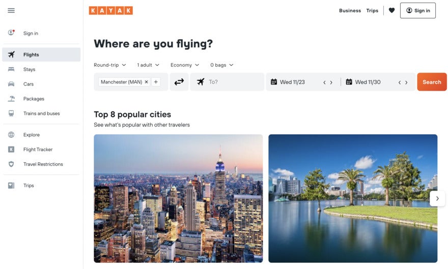
If you’re tempted by a sticky menu, make sure it compliments the type of business you have. Singular businesses like food delivery are perfect for a sticky menu – the user might want to browse options, but they’re always going to end up on the “order food” page.
Advice from the Experts
Top Tip: Because sticky menus can turn people off, make sure they’re as basic as possible. Choose contrasting colors so they’re easily seen, and avoid blocking the view of the page underneath.
#5. Limit the Number of Items
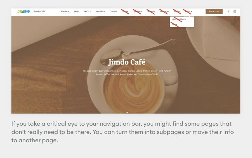
Keep the number of menu items available to a minimum or you’ll end up giving your visitor a bad experience. They’ll have too many options, and will get choice paralysis.
So choose between five to nine options, based on importance. That’s enough of a foundation to make your customer happy, but it’ll still let them learn about your brand and products. Collapse any items that are logically related to one another. Jimdo, a website builder, gives a great example of limiting your navigation to what’s necessary.
#6. Include a Search Bar
If you’re on a particular website for the first time, you might not know how to find something specific. That’s why search bars are a must. Picture this: you want to see a particular movie, so you visit a theater chain website like AMC. The website could bombard you with all of the titles currently playing and all the locations, but a search bar means you can skip right to buying the tickets that you want.
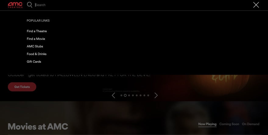
The search bar gives your audience a shortcut to exactly what they’re looking for. It cuts down on site abandonment and makes your customers happy. Think about the most important search terms that a customer would use on your website and include page results for them.
#7. Indicate Where a User Is
Location indicators will let your audience know where they are at all times so they don’t get lost on your website. Have a look at the websites you enjoy and see what types they use.
Common location indicators use color, text size, or arrows to highlight the user’s path. University websites are great at location indication because they have different users (students, staff, parents, friends, and visitors) using different paths through the site. Howard University’s Graduate page features different colors on the left menu, so you know which pages are relevant to the graduate experience.

#8. Link Your Logo
One of the most common website navigation expectations is that clicking on a logo takes the user back to the homepage. Following this is important because it both meets their expectation and gives them a chance to reorient themselves. It’s a reset button.
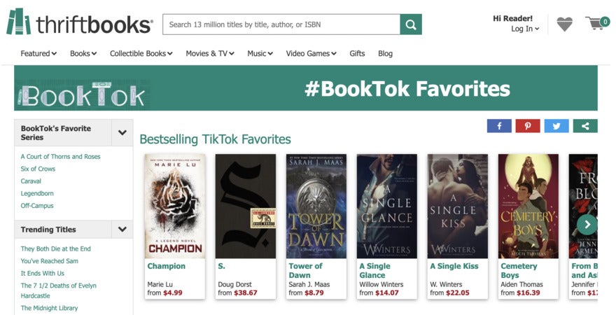
Most people place their logos on the top left of the webpage, like Thriftbooks. Some websites (especially those with long pages) add a logo somewhere in the bottom banner too.
#9. Ensure You Can Access Any Page From Everywhere
All of us have gotten lost down a rabbit hole in a website. Then it hits us – we need to see the page we read about 7 pages ago again. So we hit the browser back button over and over trying to find that page. But somehow we can’t find it. Ugh. If you allow your visitor to access all the pages on the site no matter where they are, this takes care of the problem.
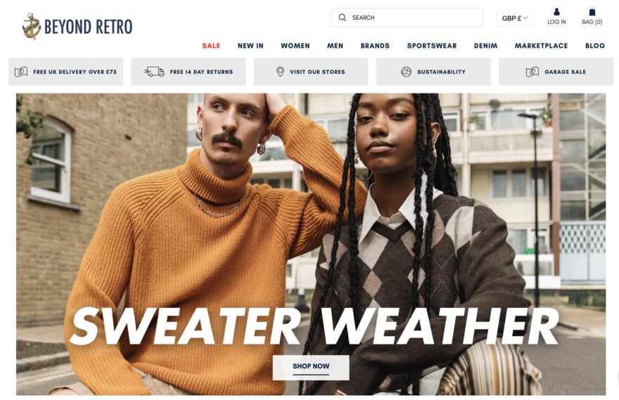
Beyond Retro’s site is a great example of anywhere navigation on the homepage. They keep drop-down menus, category shortcuts, and a search bar so that a visitor always has multiple ways of getting to where they want to go.
#10. Consider Mobile View
This is probably the website navigation issue most newcomers don’t deal with, but it’s the most costly. 90% of the worldwide internet-using population uses a mobile device to go online at least some of the time. But mobile users also have the highest rate of shopping cart abandonment at 85.65%! The reason? Websites that aren’t optimized for mobile are a huge turnoff.
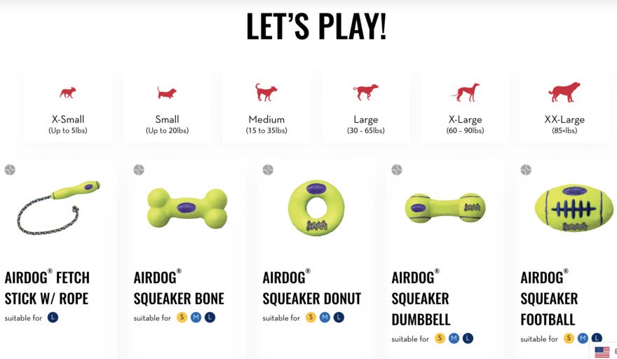
The Kong Company has a website that’s desktop friendly.
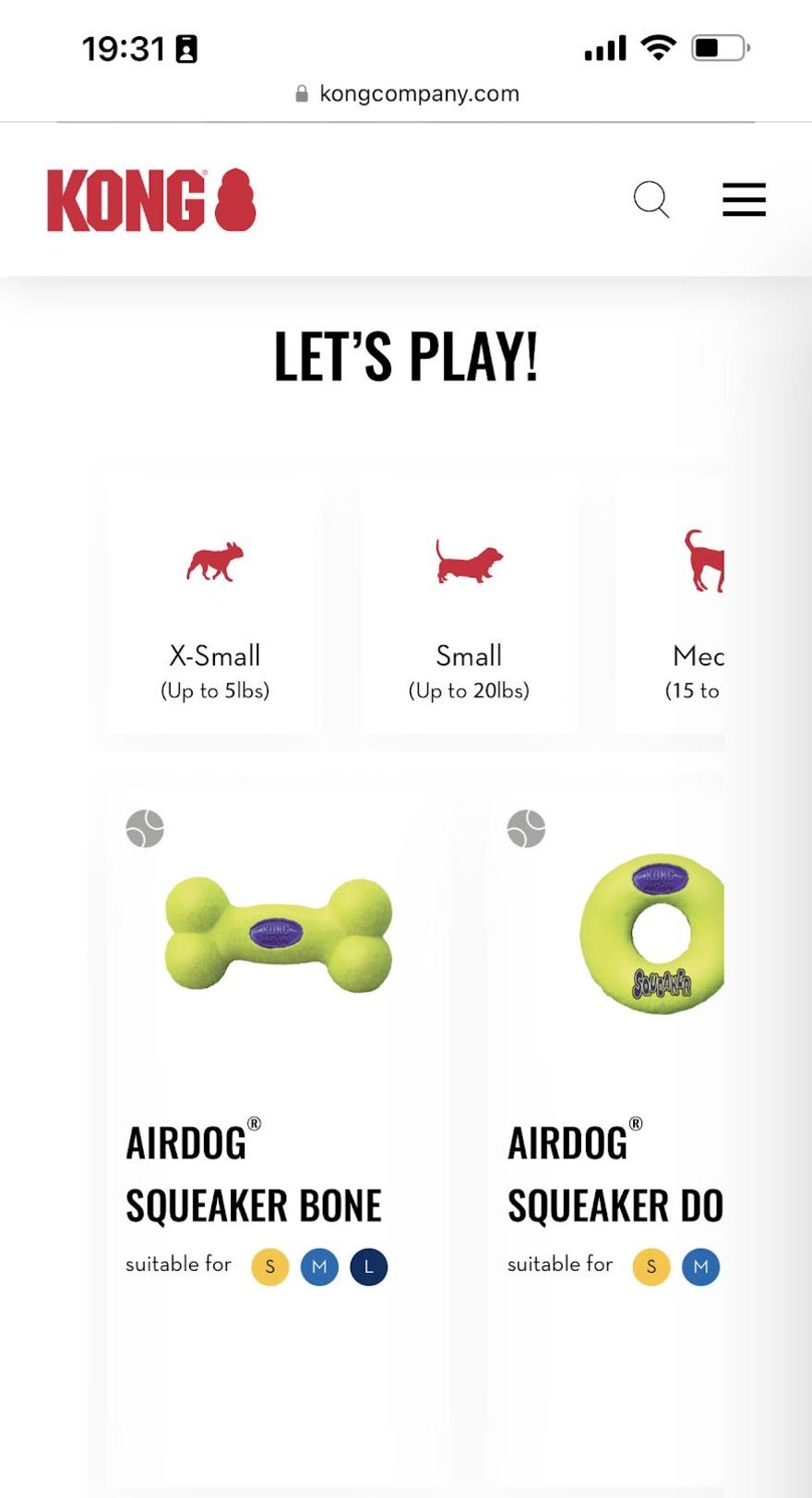
Though its mobile version for the same point on the site might look a little off-the-page, Kong have added scrolling options that mean the page can include all the information that the desktop includes. It’s a good way to help a user navigate easily.
Optimizing your website for mobile use can be fiddly, but there’s too much at stake if you get it wrong. It will require doing some research and figuring out how to make your website mobile-friendly. If you’re short on time, hire someone to do it for you.
Advice from the Experts
Top Tip: If your website has different site pages depending on a customer’s country, give them an option to choose a different location. It’s very frustrating if you want to look at the products available in a different country only to have the website constantly correct back to the customer’s origin country.
Summary
Good website navigation is a key factor in the success of a website or online store. With these website navigation best practices, you’ll be able to strengthen your website’s user experience. And that’s exactly what you need to convert sales and also build long-standing relationships with customers.
If you put practices in place, such as using your logo as a home button, letting your customer know where they are and where they can go, making your searches easy, and keeping your information clear to see, you’ll be on your way to success.
More information
- Own a medical spa? Get design tips for your spa’s website
Leave a comment